We are very excited to announce the launch of our newly designed website. Visit us at www.synergyenrollment.com. After months of hard work and dedication, we now have a faster, easier to navigate, and more user-friendly website.
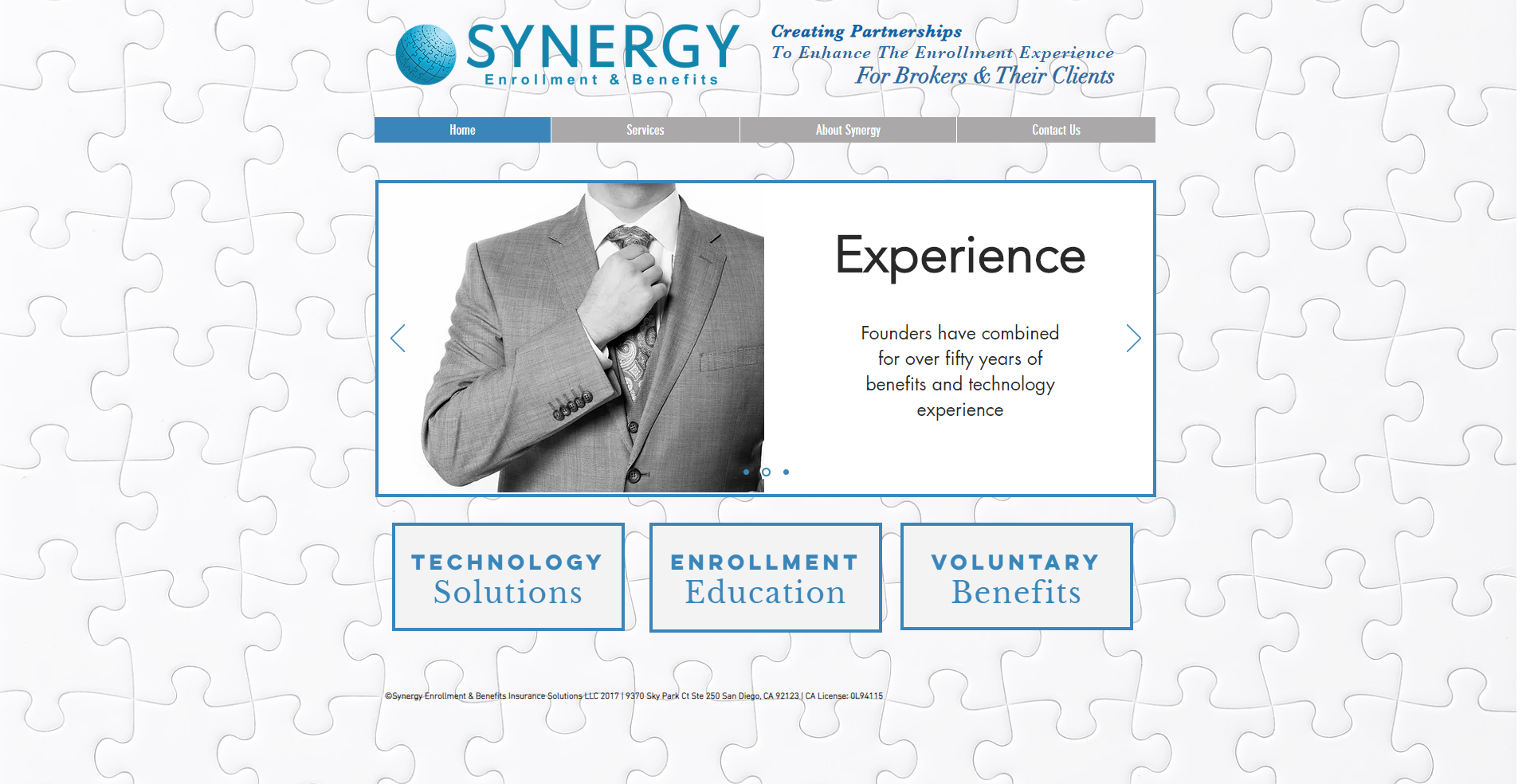
Before
Before the redesign, our website looked like this.
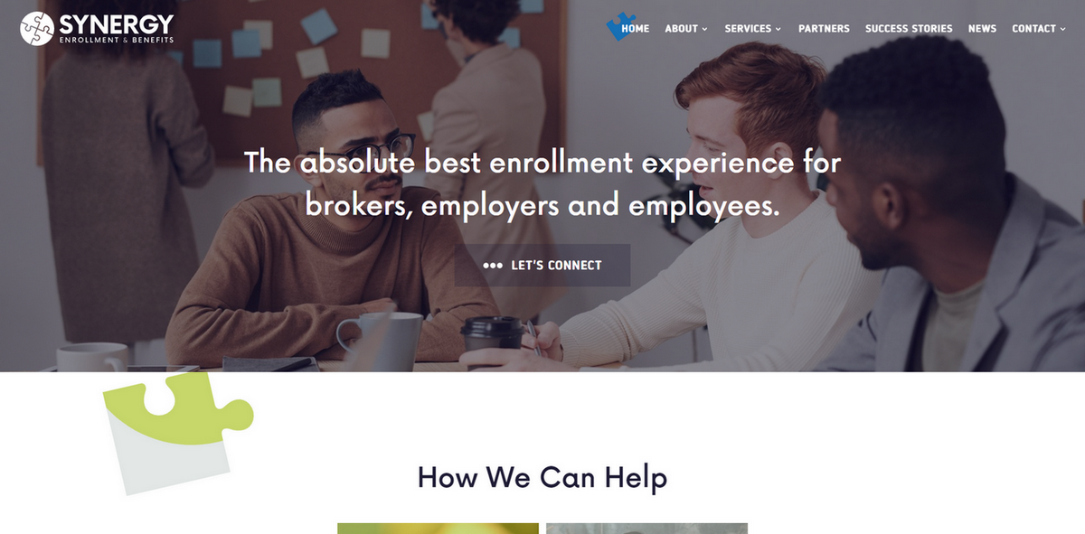
After
Now, our website has a newer look. The redesign wasn’t just about looks, it was about creating an easier experience with enrollments.
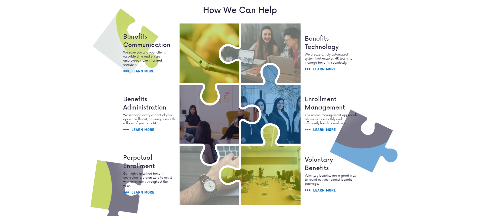
The new design in depth
Our goal with this new website is to provide our visitors with an easier way to learn about what we do and to browse information based on their own choice.
Our current and prospective clients will find useful information about our services/products on the homepage of our website.
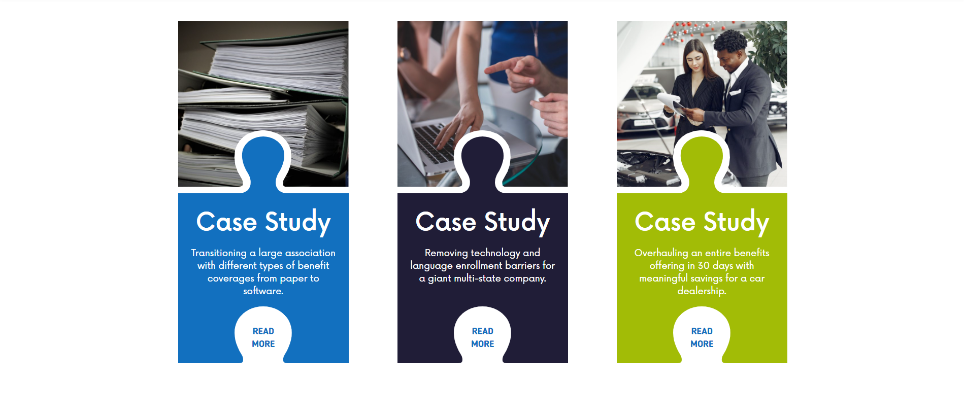
The case studies will highlight the projects we have completed and outline how we have designed growth and created new value for our clients across a myriad of industries.
Among the new features, the site contains integrated social media buttons for Facebook, Twitter, and LinkedIn to foster improved communication with the clients.

We will be constantly updating our content with helpful information, cutting edge thought leadership, company announcements, and client successes in the News section. You can also sign up for our newsletter.
We would also like to thank the amazing team at Runningfish for all the expertise, time, and the energy put into creating our brand identity, this website, and our overall digital presence – we wholeheartedly recommend them!
Thank you for being part of our journey and we hope you enjoy our site as much as we do. We are looking forward to all your questions, suggestions, or feedback over e-mail, and don’t forget to share the good news!
